Page Elements in RL6
The following screen elements are seen on the various pages and
|
Element |
Image |
Description |
|
Last File Opened / Incomplete Files |
|
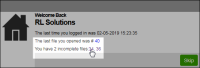
When you log in to the RL6 application, a Welcome Back page is displayed to show you the last file you opened, and your incomplete files. To continue working on the last file you opened or your incomplete files from the previous session, click the File ID link to open the file. |
|
Announcement page |
|
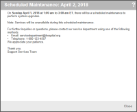
When you log into the RL6 application there may be times when you will see a general system wide announcement. These announcements are created by your administrator when general information (e.g. scheduled maintenance) needs to be communicated to all users. Once you have read the announcement, click Close to close the |
|
Lookups |
|
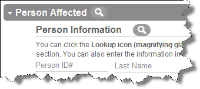
Click the Magnifying Glass icon to find information to insert into one or more fields. In this example, clicking the magnifying glass will open the Patient |
|
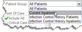
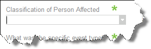
Drop-Down Lists |
|
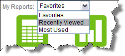
Standard drop-down lists are used in the reporting and search tools. Click on the list to reveal the options that can be selected.
|
|
|
|
Some lists are |
|
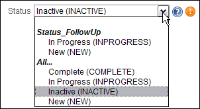
Drop-Down Lists (Searchable) |
|
The majority of drop-down lists are searchable. When you click in a field, all of the available options appear. As you type in the field, the list shrinks. Only values that start with the text you type are displayed. In this example, the drop-down list was filtered to contain item that start with Use the Up or Down arrows keys to highlight the desired item and press Enter to make the selection. You may also use the mouse to scroll through the list and make your selection. |
|
|
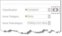
RL6 forms can be designed with a “constraint clear” button to help you clear out multiple field selections. In this example, when the highlighted button is clicked, the Classification, Issue Category and Issue Subcategory fields are emptied. This allows you to quickly reenter an appropriate combination. Without this button, you would have to clear the last two fields in order to see all the options available in the first. This feature can only be used for fields that have been grouped into a constraint set. |
|
|
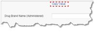
Copy Value Button |
|
The copy value button is used to quickly enter data by copying values of another field and can be placed anywhere on the form. For example, for medication errors, “Medication Ordered” and “Medication Administered” are usually the same, and in this case, the copy value button makes entry more efficient. This button can be used to populate multiple fields, if desired. |
|
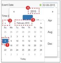
Date Fields |
|
Date fields can be entered two ways. Type the date into the field using the
|
|
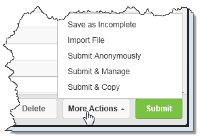
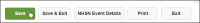
Buttons |
Taken from RL6:Risk:
Taken from RL6:Infection:
|
Buttons generally appear in the lower right corner of the page or |
|
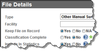
Required Fields |
|
Required fields are marked with a green asterisk. These fields must be completed in order to save a file. |
|
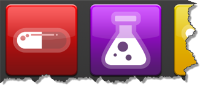
Icons |
|
Icons are used to access submission forms and are accessed on the Icon Wall When you hover over an icon the name and/or description of the form appears. You can also access the submission forms by selecting the form from the drop-down list or by typing the form name into the field until it is |
|
|
Used to view the patient inbox |
|
|
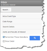
Search Sidebar |
|
The Search Sidebar appears on the left side of a page and is collapsible. It displays various options that affect what appears on screen. For example, from the Inbox page, as shown here, the inbox options are accessed by clicking on the titles and selecting criteria. |
|
Loading Icon |
|
Displays whenever RL6 is retrieving data from the database, such as when you search for files or generate a report. When working with a file, this icon may also appear after selecting a value from a drop-down list. Based on your selection, RL6 determines if additional fields should be added to the form. |
|
Results Navigation |
|
If more records are available than can fit on a page or in a widget, use the navigation features at the bottom of the list to view more records. You may expand the number of records shown on a page, advance to the next or previous page, or jump to a specific page. |
|
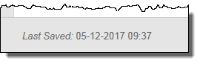
Last Saved Date and Time |
|
In an open file (i.e. submission or management form), the most recent saved date and time for the file will be saved at the lower left corner of the button bar. The date and time is updated any time the file is saved. |
|
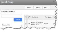
Check Boxes |
|
Check boxes allow you to select the records that you would like to perform an action upon. In this example, you see your |
|
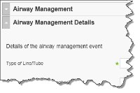
Sections |
|
Sections help group similar information into one area on a page. In this example, Airway Management and Airway Management Details appear in different sections. The Airway Management section is collapsed, which allows the Details section to display without scrolling. Sections can be collapsed or expanded by clicking on the arrow next to the Section name. For submission and management forms, the section titles appear in the Table of Contents panel, which allows you to quickly navigate to the desired section. |
|
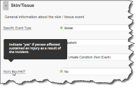
Dashed underline (Tooltip) |
|
A dashed underline under a field indicates that the field has a description different than its caption. Hovering over a field name with a dashed underline exposes the tool-tip, which contains the field's description. Additionally, hovering over a picklist value with a description will cause the tool-tip to appear. However, picklist values with descriptions are not indicated with a dashed underline. Note: This element does not appear in Safety Huddle submission forms. |