
Chart Details Section
Note: Document
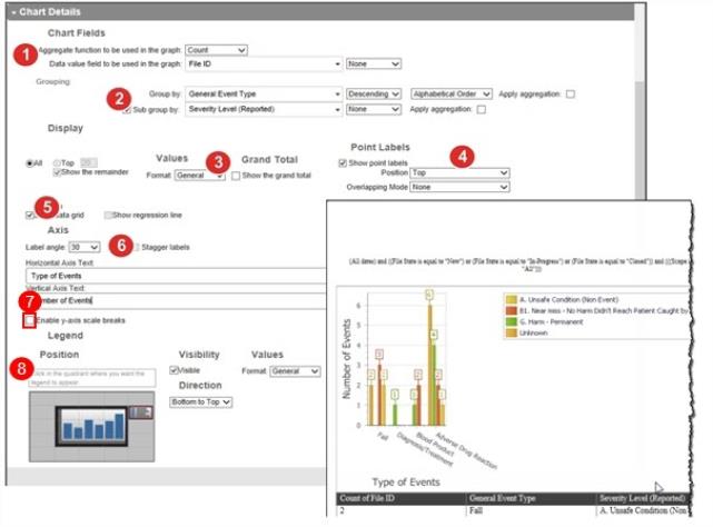
The following properties are found in the Chart Details section:
- Aggregate function – determines how data represented in the chart is calculated. For example, it can be calculated as an average, unique count, sum, etc. For bar and stacked bar charts, if the Calculate as percentage option is selected, the aggregate value will be converted into a percentage.
Data Value – determines the vertical axis (y-axis) or in a pie chart, the “whole” value. - Grouping – determines what value appears on the horizontal axis (x-axis). In this example, the general event type is sub-grouped by reported severity level. For groups and subgroups, you can choose the sort order and sequence (i.e. Ascending or Descending in Alphabetical order or in the way they appear in the Pick List). For multi-pick lists only, if you want to concatenate fields, select the Concatenate check box.
- Note: Trend fields in the Group by and Sub group by drop-down lists must be based on the same date field.
- Values – determines the format of the numbers appearing on the chart. For a pie chart, you might change this to a percent or if the values have many decimal places, limit the places shown.
- Note: If format is set to General, the format will default to 2 decimal places.
- Note: Selecting Percent from the Format drop-down
- Point Labels – determines visibility and display format of the aggregate total for each group.
- Data Grid – displays a tabular view of the data--- used to build the chart.
- Note: The following properties apply only to Control charts (not shown):
Standard deviation (σ): This field allows you to choose the standard deviation value (1, 2, or 3 sigma) that calculates the Upper Control Line (UCL) and Lower Control Line (LCL) for the chart. By default, 2σ is the value selected.
EWMAExponentially Weighted Moving Average. A moving average chart that flattens the peaks and troughs to highlight the underlying trend of what is being reported. Line (λ): The Exponentially Weighted Moving Average (EWMA) is a statistic for monitoring the process that averages the data in a way that gives less and less weight to data as they are further removed in time. By default, this option is checked and the value is 0.3 lambda. It helps determine at what times the process being measured is out of control. - Axis – allows you to label the horizontal and vertical axis values.
- Enable Y-axis scale breaks - allows you to reduce the size of the y-axis by removing large gaps between data points. This will ensure that the bar chart stays within the page's dimensions.
- Legend – determines if the legend is visible, where it appears in relation to the chart, the format of the value, and the order of values within the legend.
Note: When building a report, do not count by multi-pick list ID when viewing multi-pick list volumes, count by File ID instead. When reporting on a multi-pick list field, the query pulls in the File IDs in case the multi-pick list items need to be concatenated per file. Counting by multi-pick list IDs will use the count of all multi-pick list values selected for that file. If you select Item A, Item B and Item C for one file and count by multi-pick list ID, Item A will have a count of 3 instead of 1. Counting by File ID will show the right count: 1.