Report Type Descriptions (RL6:Infection)
RL6:Infection provides eleven different report types, described in the table below. Nine report types display information in a graph or chart, and the remaining two presents information in a tabular format.
|
Type |
Description |
Sample |
|
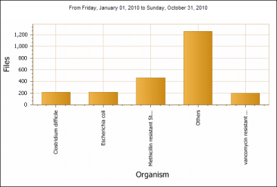
Bar Chart |
A bar chart is a type of report that uses vertical, rectangular bars with lengths proportional to the values that they represent. Bar charts are used for plotting discrete data, such as quantity of surveillance files for a particular location, organism or follow-up action. The information can be broken into groupings of one, two or three levels. In this example, the total number of files is shown (y-axis) for the top four organisms (x-axis) with the rest of the organisms making up the “Other” bar. |
|
|
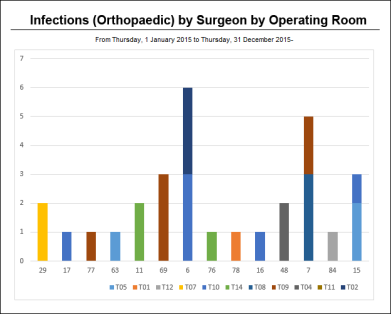
Stacked Bar Chart |
A stacked bar chart is a variation of the bar chart. It allows you to show the subgrouped element in a single bar, differentiated by |
|
|
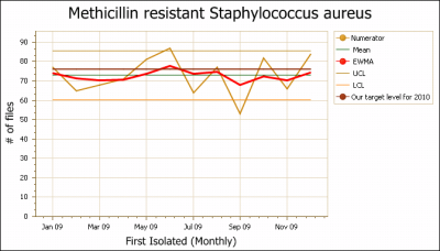
Control Chart |
A line chart that contains additional statistical analysis features: upper control limit, lower control limit and EWMA If the EWMA goes outside the control limits, the process is “out of control.” Some part of the system has changed and has had a significant effect on what is being observed. The statistics determine that the change is highly unlikely to be purely by chance alone. The parameters for the control chart can be adjusted: λ is the weighting factor for the EWMA and K is the number of standard deviations used for the control limits. This example shows a control chart of isolates of MRSA by month, and also includes a benchmark. |
|
|
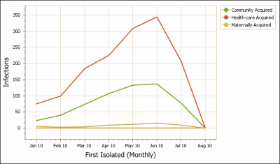
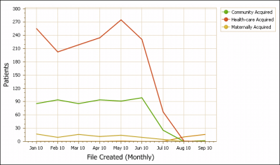
Cusum |
A CUSUM (short for cumulative summation) is a comparison between the observed values within each reporting period and the average over the whole period of the report. Interpreting CUSUM charts focuses on the direction and steepness of the lines. Trending upwards indicates above average observations; downwards indicates below average. This example shows that community and healthcare acquisition sources were above average from January 2010 to June 2010. |
|
|
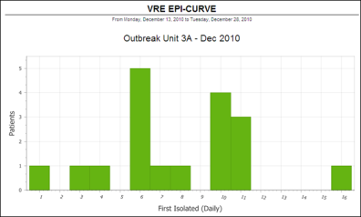
Histogram |
A histogram consists of tabular frequencies, shown as adjacent rectangles, over discrete time intervals. It is commonly called an epidemic curve or epi curve and is used to display cases in an epidemic or outbreak. Time is plotted on the X axis and incident cases on the Y axis. The distribution of cases over time can be used to propose hypotheses on the nature of the disease and its mode of transmission (e.g., point source, continuous source, intermittent, etc). Epi curves may be useful for determining the incubation period of the |
|
|
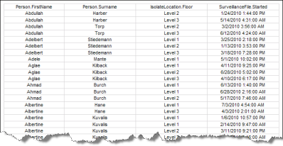
The line listing report allows you to select which fields from the selected Context In this example, the patients name, floor and date the surveillance file was created is displayed in a table. |
|
|
|
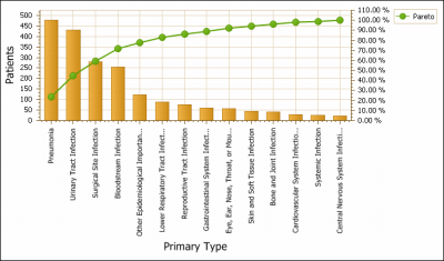
Pareto Chart |
A Pareto report highlights the proportions of the observations in a report and is an alternative to a pie chart. It places the most frequent observation first and the rest of the observations in order of decreasing frequency. The line on the chart indicates the accumulated percentage of the observations. Using the chart shown here, one can see that just over 70% of all infections are of the first four primary infection types reported. Pareto charts can assist Infection teams or stewardship teams in selecting high problem events for improvement. |
|
|
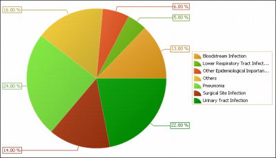
Pie Chart |
A pie chart is a circular graph divided into sectors, illustrating proportion. Pie charts can be an effective way of displaying information if the intent is to compare the size of a slice with the whole pie, rather than comparing the slices among them. In this example, each slice is an infection type. Their relative size shows the incident types that make up the portion of surveillance files reported. |
|
|
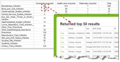
Rate Table |
A rate table shows the numerical data in the form of a table. Click any of the numbers in the table to show the individual data items that make up the numbers. From the Returned Results Tip: Right-click the File link and choose Open in New Tab or Window to view the file without navigating away from the report. |
|
|
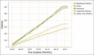
Running Total |
A running total chart shows the accumulated count of what is being reported as a line. The running total chart is particularly useful for financial reports that can show the accumulation over time of estimated money spent in financial burden of healthcare acquired infections. |
|
|
A simple line chart shows the trend over time for the data included in the report. This information can contain a grouping at either one or two levels. The Sub Group field in the Show section can be used and creates a separate page for each sub-group. When grouping at two levels, a line is produced for each value within the first level. A grouping with two levels will produce a page with each sub-grouping. In this example, there is a grouping at only one level. There is a line for each acquisition source: community, healthcare and maternally acquired. |
|