Form Properties
When a Form element is selected, the General, Constraints, Action and Buttons (submission forms only) tabs are shown:
|
|
Field |
Description |
|
|
||
|
|
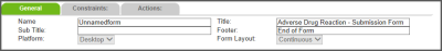
Name |
The name of the form as it appears to the administrator. |
|
|
Title |
The name of the form as it appears to the end user. |
|
|
Sub Title |
The subtitle of the form as it appears to the end user. |
|
|
Footer |
The text that should appear at the bottom of the form. |
|
|
Platform |
The platform specifies where the form can be used (i.e., if form is for a Desktop submission or a Mobile submission). |
|
Enable in File Access Level (*Requires at least "Committee" or "Infile Access Level field" on form) |
When set to True, In File Access security for Peer Review forms is enabled. Once set to True, the system will calculate the role of any user attempting to open a file and display content according to defined business rules. If set to False (or undefined), In File-access security is not applied to the form. Note: This setting is typically applied to Peer Review management forms only. In submission forms, no committee members, providers and reviewers are defined for the file. |
|
|
|
Form Layout |
The layout type of the form. There are two options:
Note: This field is pre-defined according to the module selected and is read-only. |
|
|
||
|
|
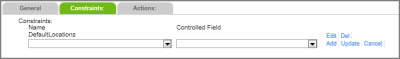
Add |
Click this link to add the selected constraint to the form. |
|
|
Cancel |
Click this link to cancel the constraint you were creating. |
|
|
Controlled Field |
Allows you to determine which field of the constraint set is automatically completed based on the selections made in the other fields. This field can only be the “lowest” or most-filtered field in the constraint set. Additionally, in order to use this feature there can only be one possible value for the controlled field after the other fields in the constraint set have been entered. The field set as the Controlled Field becomes read-only on the form. One constraint set that can use this functionality is You might also employ this functionality to auto-complete the Country field based on the selected State/Province (as shown in the graphic above): choosing |
|
|
Del |
Click this link to remove the constraint used on the form. |
|
|
Edit |
Click this link to modify the constraint used on the form. |
|
|
Name |
The name for the constraint(s) used on the form. |
|
|
Update |
Click this link to update the constraint used on the form. |
|
Actions Tab |
|
|
|
|
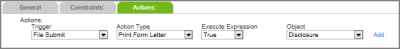
Trigger |
The activity that triggers an action to occur. |
|
|
Action Type |
Allows you to determine the object that is available after the trigger occurs. For example, after a user submits a file by clicking Submit, the “Print Form Letter” action will make all form letters relevant to the form’s module available. |
|
|
Add |
Click this link to add the selected action to the form. |
|
|
Execute Expression |
Allows you to define if the action type will happen for every circumstance the trigger occurs. “True” sets the action type to execute every time the trigger occurs. Setting the action type to “False” is a temporary way to disable the action without removing or deleting the expression, so that you may use it again in the future. Setting the action type to “Calculated” brings you to the Expression Editor (Building an Expression). |
|
|
Object |
A dynamic list of objects that are relevant to the selected Action Type. |
|
Buttons Tab (submission forms only) |
|
|
|
|
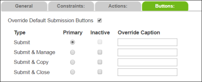
Override Default Submission Buttons |
The default submission buttons are Submit (as the primary button) and Submit & Manage, Submit & Copy and Submit & Close, which are available in More Actions. Select this check box to override the defaults to show/hide buttons, to modify the button captions, or to promote a different action to be primary. Note: The Submit & Close button is only available if the |
|
|
Primary |
The primary button appears in green on the bottom right corner of the form where the If however a user does not have the role function for the new primary button set by the administrator, One button must be set as the Primary if the |
|
|
Inactive |
Determines if the button appears on the form. By default, all buttons are active. |
|
|
Override Caption |
Determines the caption that appears on the button. If empty, the default captions appear (i.e., Submit, Submit & Manage, Submit & Copy and Submit & Close). Note: Buttons can display up to 50 characters. If the caption is longer than 50 characters, the entire caption can only be displayed in hover text (i.e., place mouse pointer over the button to see hover text). |