Report Types
RL6 provides nine different report types, described in the table below. Seven report types display information in a graph or chart, while the remaining two present information in a tabular format.
|
Type |
Description |
|
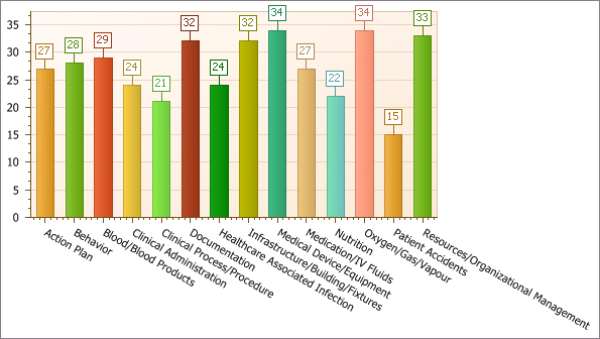
Bar |
A bar chart is a type of report that uses vertical, rectangular bars with lengths proportional to the values that they represent. Bar charts are used for plotting discrete data, such as quantity of cases for a particular location, event type or follow-up action. In this example, the total number of files is shown (y-axis) for each event type (x-axis). Note: Data in a bar chart can also be calculated as a percentage, provided the Sub group by field is empty. Sample:
|
|
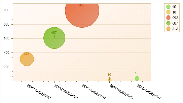
Bubble |
A bubble chart is a type of report where each plotted entity is defined in terms of three distinct parameters. The entities displayed on a bubble chart can be compared in terms of their size as well as their relative positions with respect to each axis. In this example, the sum of Money Spent is represented by the bubble size with Location IDs along the x-axis and the total number of cases along the y-axis. Sample:
|
|
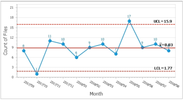
Control |
A control chart is a graph used to study how a process is changing over time. Data is plotted chronologically. A central line indicates the average, an upper line indicates the upper control limit, and a lower line indicates the lower control limit. By comparing data to these lines, you can draw conclusions about whether the process variation is consistent (under control), or is unpredictable (out of control, affected by special causes of variation). Sample:
|
|
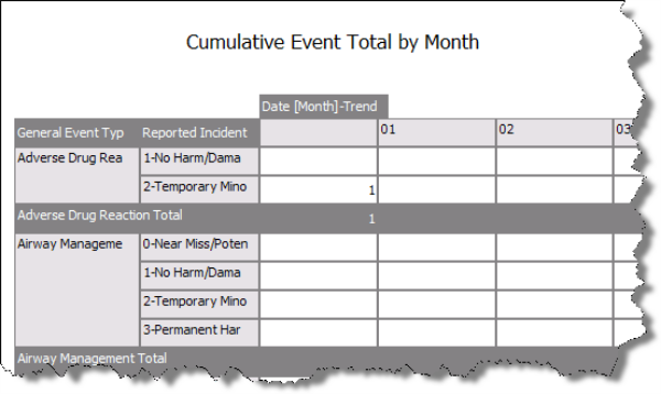
Crosstab |
Crosstab reports create summaries of data in a spreadsheet style format. They generate summary data in a grid where the rows and columns represent groups of data. This provides the user with a report format that is easy to read and uses a small footprint on the page. Sample:
|
|
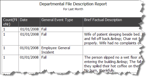
Document |
Document reports may contain vast amounts of information displayed in a tabular format. They are used for analyzing and assessing the information in a more in-depth manner. Sample:
|
|
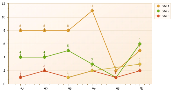
Line |
A line chart displays information as a series of data points connected by straight line segments. The points represent individual measurements. A line chart is often used to In this example, the number of files created for a six-month period of time is shown for three sites. Sample:
|
|
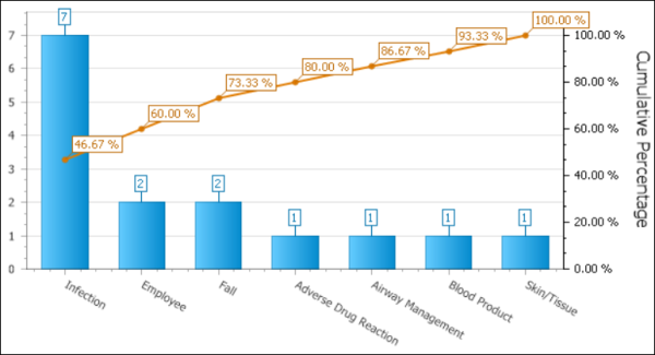
Pareto |
A Pareto chart is used to graphically Note: This option is only available in Report Editor (i.e., Pareto charts cannot be created/edited in Question Wizard or Report Designer). Sample:
|
|
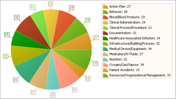
Pie |
A pie chart is a circular graph divided into sectors, illustrating proportion. Pie charts can be an effective way of displaying information if the intent is to compare the size of a slice with the whole pie, rather than comparing the slices among them. In this example, each slice is an event type. Their relative size shows that there is no one event type that makes up a substantial portion of files reported. Sample:
|
|
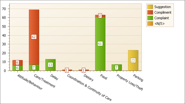
Stacked Bar |
A stacked bar chart is a variation of the bar chart, as described above. It allows you to show the subgrouped element in a single bar, differentiated by In this example, the total number of files is shown (y-axis) for each feedback category (x-axis). The subgrouping element is the feedback classification; it is shown in the legend and as the various Note: Data in a stacked bar chart can also be calculated as a percentage. The sub-grouped value will reveal the percentage in relation to the group. Sample:
|